Check out this in-depth article about Intaglio Editions’ Jon Lybrook from ShoutOut Colorado:
https://shoutoutcolorado.com/meet-jon-lybrook-owner-and-lead-printmaker-intaglio-editions-llc/
Check out this in-depth article about Intaglio Editions’ Jon Lybrook from ShoutOut Colorado:
https://shoutoutcolorado.com/meet-jon-lybrook-owner-and-lead-printmaker-intaglio-editions-llc/
Joanna Webster – Botanical Photogravure Proof
“From Powder to Print” – | PDF: Joanne Webster – ASBA March article
Combining the “carbon dust on paper” technique with traditional intaglio printing processes
THE TECHNIQUE OF USING CARBON DUST ON PAPER to create realistic and detailed renditions was developed by renowned medical illustrator Max Brödel in the early 1900s. I was first introduced to this technique by artist Randy Raak at the Denver Botanic Gardens’ School of Botanical Art and Illustration, and I quickly came to love it for its ability to create very subtle changes in a wide range of tonal values, from deep black shadows to vivid highlights, as well as intricate, highly refined details.
Put simply, this technique involves the application of finely-ground carbon dust to paper using dry brushes. Semi-smooth paper with a slightly toothed surface catches the dust better than a smooth plate surface, but still allows for fine detail that won’t be achieved with a more textured paper typically used for charcoal and pastels.
Carbon dust is not the same type of carbon as graphite or charcoal. Graphite particles are slippery, plate-like particles that are highly reflective. Carbon dust is made from the soot of burnt oil, also known as “lampblack.” The particles are non-reflective, and are much smaller and more uniform in shape and size than charcoal, which is made from burnt wood.
I create my own carbon dust by gently grinding down a carbon pencil with a metal or glass file, or an ultra-fine plastic-backed sandpaper (typically used in jewelry making). There is no difference in tone between carbon pen- cils of different hardness, so using a soft (6B) pencil will make this process faster and easier. I use inexpensive synthetic watercolor brushes in a range of styles and sizes to apply the dust to paper. You can play around with other types of applicators but you need to be really careful not to tear or burnish the paper fibers. Carbon dust does not erase easily like graphite does, so a very light touch is needed when first applying with a brush. I keep a soft, lint-free cloth at hand to remove excess dust from the brush before applying to paper, especially when I am working on very thin layers for lighter tones.
I use a variety of additional tools to work, lift, and erase the carbon dust, such as kneaded erasers, plastic erasers, and chamois cloth. To achieve clear, bright highlights, I use a thin, mechanical eraser pencil with the tip cut into a sharp wedge or point.
To achieve deep, rich, saturated blacks, I apply multiple layers of carbon with a spritz of isopropyl alcohol as a fixative between layers. Using this over the entire work as a final fixative prevents smudging. To achieve very fine lines and details, I use a hard (B or 2B) carbon pencil sharpened to a very fine point.
To protect the paper while I work, I use a layer of tracing paper, leaving only the area I am working on exposed. If carbon dust drops where it’s not wanted, it’s best to lift the paper upright and tap the carbon dust off, then pick up any remaining particles gently with a kneaded eraser.
With the series of botanical carbon dust “dry paintings” featured here, I engaged the help of photographic printmaking expert, Jon Lybrook (intaglioeditions.com), to transfer the carbon dust images to photopolymer direct gravure plates. I then worked with fine artist and master printmaker Sue Oehme (oehmegraphics.com) to ink and print the plates on paper by hand, using a traditional printing press. The photopolymer plates allowed for very accurate transfer of the fine detail and tone created with the carbon dust technique.
The delicate and subtle nature of the carbon dust, with its wide range of tonal values combined with the soft and velvety background created by the inked plate embossing into the paper, lend the finished artworks a rich and luminous quality that, to me, is reminiscent of old gelatin silver photographs.
Tony Levin King Crimson Photography Interview
Conducted by Anthony Garone of Make Weird Music – September 2021
Interviewer [00:00]: We are here with Tony Levin in his workshop/studio. And Tony is the basis from King Crimson, Peter Gabriel, and about a thousand other bands he’s played with everyone, just everyone. If you have 10 CDs, you have a CD with Tony Levin on it. So, we are here to talk about Tony’s new collection of photographic prints. It’s a King Crimson box set. What is this set of prints?
Tony Levin [00:32]: Well I’ve been playing bass a long, long time, pretty much since the earth cooled. And most of that time I’ve been taking photographs and I wouldn’t call myself a professional photographer, but that’s because I’m busy playing my music, but I got pretty seriously into it as early as the eighties. And I tried to focus on taking pictures of the bands that I was touring with King Crimson, Peter Gabriel, and others, and in this studio also. And sometime in this last couple of years, I put out a few books of those photos, by the way. And sometime in the last few years, I felt the need to take the best, what I felt feel are the best of those and present them to the public in a really high-quality way and get the best prints possible made from them. It’s been an interesting adventure choosing them and then collating them and having Jon Lybrook do the excellent, super-quality print of them.
Interviewer [01:27]: Can you talk a little about your sort of interest in photography? Like, was it a hardware thing first or was it, did you see an artist that inspired you as a photographer that made you want to do it?
Tony Levin [01:40]: Interesting question. Always interested in photography as a lot of people are. And I kind of muddled around with it a lot of different cameras. I was very lucky that I went to Japan at an early age and this would be in the seventies and was able to get a high-quality Nikon back then when it was a very expensive item here in the states at a reasonable price in Japan, it was a very different economics situation in those days. And shooting film for those of us old enough to remember is a very different experience than shooting digitally on the road. And it was pretty problematic and tricky to shoot regular pictures on the road with bands and get them developed and see how they look, and then make the adjustments at other shows in other cities, in other countries. So, I got used to that, and experimented with it and tried different things. And occasionally I got lucky and got the pictures I wanted.
Interviewer [02:40]: Are you a full-frame shooter, you know, medium format? Like, what do you get in that level of Specifics?
Tony Levin [02:46]: I had a Mamiya RB 67 medium format, and I loved that camera. And I even lugged it around to take pictures. And I’m not talking about with the tripod I mean talking about while I’m playing the bass, picking up this big thing, and trying to shoot. Mostly, I did that with Peter Gabriel. I got some very good pictures which are in some of the books, but in the weeding down process for the pictures I’ve used for the collection those pictures didn’t make it for various reasons when you have, tens of thousands of pictures, and you’re going to get the best eight of them a lot has to go by the wayside.
Interviewer [03:23]: Can you talk about perhaps film versus digital, you know, as a photographer, do you feel like you know, some people say, oh, I only record music on tape, you know, and then there’s the pro tools crowd. They’re like, it doesn’t make a difference. Are you in that sort of a camp? Do you prefer one or the other?
Tony Levin [03:41]: I loved film and I love digital now. I made one of the biggest mistakes in my photographic career, the biggest mistake, switching to digital too early. So, there’s about five, six years of stuff that I’ve got, good photos but they’re not usable. They’re just too low quality because I switched to digital when it was very small. Yeah. So, I don’t have a preference, it was a wonderful process. I loved the smell of the darkroom and I loved that process. And even that smell brings me back to those years that I spent a lot of nights in my darkroom in New York City, my studio apartment, it wasn’t completely dark except at night. So, I would regularly nightly, I would spend the night developing pictures, and then sooner or later one would come out not looking right. And I would look out and realize the sun had come up and it was going through the studio apartment and just barely seeping into the kitchen, which I had curtained off with dark curtains. But it wasn’t enough. So, that was a great process, but so is Photoshop. And so is the digital world.
Interviewer [04:54]: And I imagine you’ve digitized your old film prints. But how many of them, like, were you select things, specific shots, or did you get everything digitized?
Tony Levin [05:06]: I did not get everything digitized, I have too many photos and I never cataloged them well, they are in one place actually here in the building we’re in. But for this, I went through a great number of them and I had already separated the ones that are better than others. And I digitized them as high quality as I could and got them ready for the job.
Interviewer [05:30]: What do you look for aesthetically, or perhaps there’s some other way that you look for a shot that you like, and are there photographers that have inspired you and your aesthetic sense?
Tony Levin [05:44]: There are photographers who have inspired me. I’m not going to name them. I’d have to go through my books to see, but I have a lot of books on photography. And I try to, as with any art, as with music you try to up your artistic sensibility by looking at the best stuff. And somehow having it seep into your sense, especially with format with photos. In my case, because most of the pictures I take, almost all of them are on the road with the same band night after night, you’re doing the same show, maybe different songs, but you’re in the same situation, different dressing rooms. Yes. But dressing rooms night after night, month after month, year after year, even the same dressing rooms. Oh, yes. Four different times I’ve taken pictures of that same guy in that same dressing room through the years. So, one looks for different things than the first time. I can’t really put into words, all the things I look for but I think after all these years, it’s safe to say that I have an eye on the light on everybody and what they’re doing and whether they’re laughing or whether they’re very serious. And if I just see a look, that’s right, I want to have my camera nearby so that I can capture it.
Interviewer [06:55]: Does king Crimson photograph the box set, tell us about it. And you know, what is in it?
Tony Levin [07:03]: Well, its eight photos, eight prints, very high quality. I can’t tell you all the details about the technical bit about the printing, but we can find that from John and very high quality, which I insisted for this, it’s really part of the work of a lifetime of photos on the road and tens of thousands of pictures of King Crimson on the road. And these are my favorites and for reasons, and to me, they tell a story and they each represent that I was lucky to be in that place at that time with a vantage point that other people don’t have from one stage or from backstage being in the band.
Interviewer [07:44]: You’ve been playing for 50 years, right?
Tony Levin [07:49]: Yes.
Interviewer [07:49]: And you know, there’s probably not…
Tony Levin [07:52]: And I’ve been playing well for five years.
Interviewer [07:56]: Yeah. There’s probably not another 50 years, you know, left to go. So, are you looking at this as like a way of, you know, producing some legacy type artwork, you know, something to pass on to the fans or, you know, how are you thinking about it?
Tony Levin [08:11]: Interesting question I don’t think like most guys and women, I know that I play with most musicians. I don’t really think about this in relation to the future. So, this is not the summing up of my career to me or however, I haven’t thought about what I’m going to do for the next book either. I just don’t think about that. When I look through the photos, I recently did a photo book of 250 of my pictures of all bands through the years, I was struck that I really have the chance to present to the public, a very high-quality collection of the images that I like the best. And so, I felt as you sometimes do with music, I felt like this needs to be shared. This needs to get out there. And if I don’t do it in, if this was in the lockdown year, I felt if I don’t do it this year, I’ll get busy touring and doing things that I really love to do and take less immersion and it won’t happen. So, I spent that year trying to get all of these boats together.
Interviewer [09:16]: For me when I’m writing music I’ll have a collection of songs that I’ve produced over the years and some stick around more than others. Is that kind of what happened with this collection? Did you have these photos in mind and at some point I’m going to release it or did you make a decision and just start going through the whole catalog and, oh yeah. There’s that one?
Tony Levin [09:36]: The ladder going through the whole catalog. I never was organized enough with my music or my photography to keep a record of, okay, these are the best. These are, these, and these and these I did have, I had them on, I think the negatives organized by tour and by year. So, it wasn’t that huge a job, but no, it involved going through them all and finding which ones resonated with me in that way, some of them, which were very good images to me and meaningful didn’t warrant, being among the prints, just didn’t warrant. Some of them were color and didn’t want to be in black and white. There were a whole lot of parameters and the ones that were there were plenty that was good. I could limit myself to eighty. It could have been 80 and we’d have a stack of photos to talk about. But I limited myself and, I feel good about the ones we chose.
Interviewer [10:29]: Did you go from 20 to 15 to 10, or did you go from 1 to 3 to, you know, 8 you know, when you were selecting these?
Tony Levin [10:37]: I think it was about 12 to 15 and the decisions on what’s practical for a collection, what I want the box set to look like, and this special custom box for the box set and things like that of course, I think many people will want the individual photo that they like the best and that’s fine. And that’s the way it should be. Yeah. So, the weeding down wasn’t that bad after the point where I headed down to 12 or so.
Interviewer [11:04]: Have you ever done an art show or a gallery of your photography?
Tony Levin [11:07]: I’ve had a few exhibitions through the years and I used to keep a box of the two exhibition sets of photos and I lost them. I lost both boxes. I have the feeling I sent them to be an exhibit somewhere and I forgot about it. And I never asked for them back. I think that’s what happened. I had one from the Woodstock festival, the second one, not the original one, just a wonderful set of prints from the audience in the mud and things like that. And that’s gone.
Interviewer [11:42]: Oh man, that’s tough. So, in your exhibitions, obviously, people know you for the bass and the stick, your music work. But how are people responding? Who doesn’t know anything about, you know, what you play?
Tony Levin [12:00]: I don’t know. I have not been to exhibitions of my photos.
Interviewer [12:04]: Okay.
Tony Levin [12:04]: What I hear a lot from is, are bands of the bands and the, of course, I put the photos on my website and on my web diary, right? My road diary and I have for many years. And I hear a lot of feedback that people love the photos, of course. And I’m probably happiest that I can finally offer it to them. Oh, you, maybe you wanted that photo on your wall. It’s nice to finally have that option. But I don’t really have too much experience of people seeing the photos, who don’t know the band or know me and what it is. I do musically.
Interviewer [12:36]: And for me, I don’t know, perhaps you’re like this, you’re an early adopter of technology, you know, you’re using digital cameras. I see you using a 360-degree camera?
Tony Levin [12:46]: Abusing it.
Interviewer [12:47]: Abusing it. And I’m curious, is this kind of like, maybe you get sick of looking at a screen and you just want to see these things on paper?
Tony Levin [13:00]: Oh, yes. I had mentioned before the tactile joy of having something that you can say, this is it, but also my life, my home, and my life are enriched by the very high-quality paintings and photos that I have on the wall. And so I have, I think, like most people, I have a high, I place a high value on the one picture that’s very special to you. And if it has a double meaning, because it, it, it involves a band that you’re a fan of, or a concert that you are at or something like that, then all the better.
Clip from a film produced in 1958, narrated by Beaumont Newhall, who was the curator of the George Eastman House.
For Immediate Release (11/17/21)
King Crimson Print Collection by Tony Levin Available For Pre-Orders, Shipping Early 2022

Bass Legend and Photographer Tony Levin’s King Crimson Print Collection Available for Pre-Orders, Shipping Early 2022
• Eight stunning, limited-edition prints spanning Tony Levin’s work with King Crimson since the early 1980s
• Every print is signed, numbered, and certified by Intaglio Editions LLC
• Prints are made by contemporary photogravure printmaker, Jon Lybrook
• Available as individual prints or in a limited-edition, custom-crafted clamshell print collection box
• The first public orders are assigned print numbers 11-50 out of 500 prints total in each edition
• Pre-orders are now being accepted at TonyLevinPrints.com
“Tony Levin is not a bassist. He just happens to play the bass.” – Robert Fripp
Tony Levin (King Crimson, Peter Gabriel) has been photographing his touring experiences since the early 1980s. Tens of thousands of photos later, he’s compiled eight of his favorite photographic moments from forty years of touring with King Crimson. These prints include:
1. Adrian Belew, Backstage 1981
2. Bill Bruford, Bristol 1981
3. King Crimson, Faro, Portugal 1982
4. King Crimson, Royal Albert Hall 2019
5. King Crimson, Asbury Park 1982
6. On the Shinkansen 1981
7. Perkins Palace Marquee 1981
8. Robert Fripp, Krakow 2018
This collection is a must-have for any serious King Crimson collector and can be purchased as a set or individually. Tony’s photography offers a unique perspective from the stage that cannot be replicated.
All photos are hand-titled and signed by Tony Levin. They are a limited print run of 500 photogravure prints. The first public orders of the Special Edition Box are assigned print numbers 11-50.
Each print is handmade on a traditional intaglio press using materials that will last for generations. They are printed with low or acid-free ink on 22.25 x 15.5” Hahnemuhle Copperplate Brite White, 300 g/sm alpha cellulose paper with torn, deckled edges. These same ink and paper formulas used in Tony Levin’s print collection have been used by printmakers in Europe for hundreds of years.
Signed and stamped certificates of authenticity are issued with every print.
The traditional, fabric-lined, limited-edition, clamshell-style, 24” x 17” print collection box for Tony Levin’s King Crimson Print Collection is custom-crafted using archive-grade materials for storing and preserving prints cleanly and elegantly. Cotton gloves are included for clean handling of the prints.
“Jon Lybrook is a true master. His prints exude an expertise, that only very few fine art printers in the world control on the same level.” – Professor Henrik Bøegh – Grafisk Eksperimentarium – Copenhagen, Denmark
Jon Lybrook is a Fine Art Printmaker based in Colorado. Jon has worked with photographers and artists for nearly two decades through his company, Intaglio Editions LLC (https://intaglioeditions.com/). He has studied the craft with traditional printmakers from around the world including Henrik Boegh, Dan Welden, Mark Lunning, Ron Pokrasso, David Hoptman, and has worked as both a printmaker and consultant.
Watch the Make Weird Music interview with Tony about his history with photography and art:


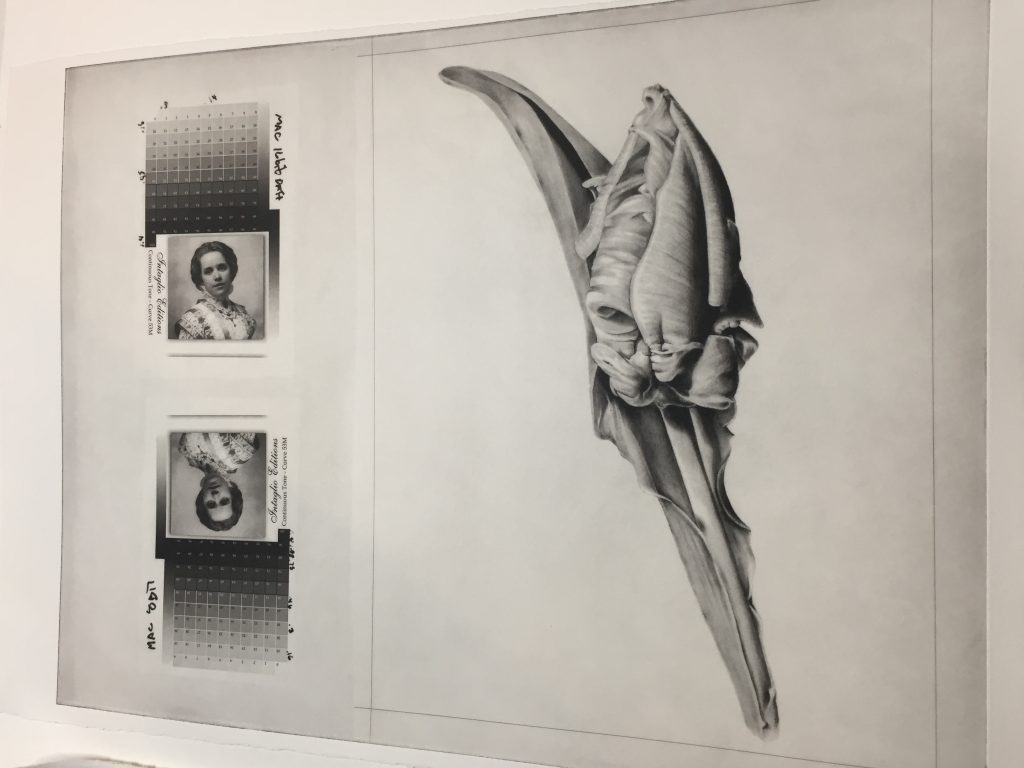
Colored ink renders a photographic image much differently than black ink-only, as any printmaker knows. At Intaglio Editions we offer two generic ink profiles for our plate customers: Graphical and Continuous Tone. Continuous Tone plates are designed to work best with the blackest inks to create richness and tones similar to platinium/plalladium prints, but with greater relief details in the shadows, not found with other approaches.
When colored inks are desired, the process is to measure and mix the ink to get to an initial color or set of colors. The ink combination is then wiped into a baseline step test plate which is then printed, dried for a week or so, and scanned. The data is then measured and transferred into a spreadsheet or computer program.
Areas of the step test that appear blocked up together, or too light or too dark can then be manipulated in a process compensation curve or using 3rd-party RIP software like Quad Tone RIP. This data is then used to craft a customized plate of the artwork in the desired ink color.
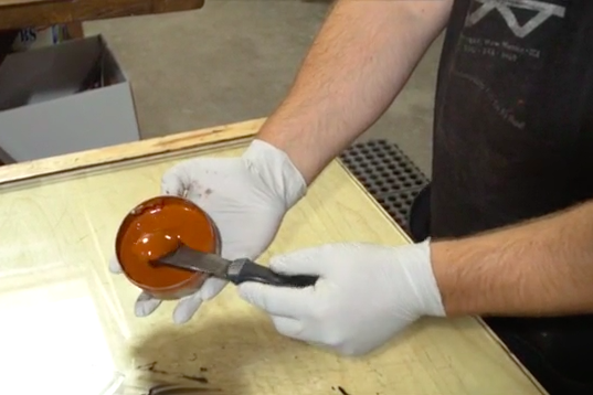
Because ink color is hard to reproduce from batch to batch, traditional printmakers will keep careful track of their formulae as well as the B.A.T., or master print, in order to match the color again, should it be necessary to replace a print or if the artist has another image they want to edition and have it match. Every color ink may have its own unique physical properties which must be taken into account when formulating the proper consistency.
Body, Length and Tack are a few of the main qualities that affect the ink and how it is received by the plate’s matrix. In some cases, the amount of plate tone and contrast can vary a bit, until the plate has been properly seasoned and the ink’s step test is properly dried and analyzed. The ink is then modified to suit the needs of the piece.
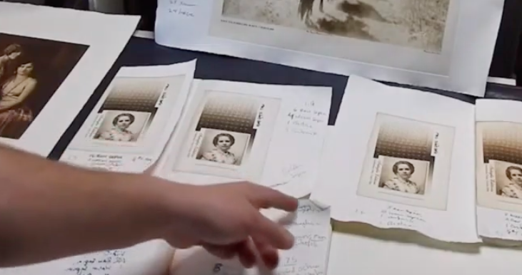
The video below demonstrates a step test ink comparison we did while providing photogravure consulting for the great-grandson of the legendary American photographer Edward Curtis. The image we made the plate from in this video was taken from a scan of a vintage, glass plate copy negative. Alas, most of the original films that remained in tact were donated to The Smithsonian and unavailable for their project at the time.
From this video you can see how even relatively graphical images contain nuances of continuous tone and relief in the shadow details that make the difference between a more traditional-quality photogravure print, and one that looks like a flat, slightly depressed and grainy inkjet print. We of course aim to produce the former using traditional approaches and 15 years of experience exclusively specializing in polymer photogravure.
For more information about Intaglio Editions projects, and contracting with us on your own printmaking project, please visit our website at https://shop.intaglioeditions.com.
Recent work with photographer Larry D. Hayden kept us hopping for a few days in August head. Here’s a little video excerpt showing off Larry’s evocative work and how we printed it.
Hi Jon,
I am an artist in Edinburgh, UK and a member of Edinburgh Printmakers. My practice includes filmmaking, photography and printmaking.
For the past 18 months I have been exploring the potential of photopolymer in relation to my film work and photography. I have followed your videos and blogs assiduously and found them very helpful. Generally I have been reasonably successful in producing a series of A3 photopolymer prints but just lately I have been plagued by scratches which as you might expect are often in critical areas and are very dispiriting.
These are dark scratches in the prints but correspond to visible scratches on the plate when examined carefully. I have gone carefully through all the stages in making the plate to try and eliminate the potential for scratches. I do use a communal workshop so it can be difficult to eliminate all variables or keep a dust free environment.
I use a Boxcar brush for washout which I have had for about 14 months and use for one plate making session weekly since I bought it. I also use an antistatic brush (Kinetronics StaticWisk hand held anti-static brushes are used for cleaning lenses, films, scanners, cameras, plastics, acrylics, jewellery, glass, monitors, instruments and technical equipment on the plate before exposure to the aquatint screen and again before exposure to the image acetate to ensure that the surface of the polymer does not have dust particles that might cause dust flares.
Checking the plate after each stage of the procedure, I have noticed scratches immediately after washout and drying. I use newsprint, paper towels and a hairdryer to dry the plate. I have thought that maybe I have been using too much pressure on the Boxcar brush and today I really tried to exert just the pressure of the weight of the brush with very little extra from my hand. I use elliptical movements across the long and short lengths of the plate and then if I have time diagonally as well. I soak the plate initially for 1 minute, washout with the brush for one and half minutes and then rinse for one minute. Even today being so careful with the brush, there were again scratches visible just after washout and drying. It’s getting to be a bit disheartening.
My photopolymer plates are Toyobo KM95GR which I get from Allflexo in the Netherlands.
Do you have any suggestions as to what I might be doing wrong?
All the best,
Olga Kaliszer
Hi Olga,
Thanks for your email. Scratches should not be too difficult to track down. Not exerting any pressure on the brush is the way to go. I also use gentle, small, circular strokes when washing out the plate.
The plates are most susceptible to scratching during washout, of course. Unlike your approach, I do the washout for two minutes and do not soak the plate in a tray, rather I keep it on an angle, pour water over the plate a little at a time as I ‘scrub’ the plate lightly and methodically. I then give it a final rinse, blot with newsprint, then dry for 5 minutes with a hairdryer, put in my plate drier for 10 minutes, post expose for 5 minutes, then do a final round of hardening in the plate drier for 25 minutes. I’d suggest not soaking the plate and increase the washout time. Bear in mind, this may change how much exposure you need to give the plates and may cause you to have to recalibrate the times.
Feel free to send images demonstrating the scratches. The pattern in the scratches should give you an indication of when they are happening. Good luck tracking down the cause and finding a solution. Also, is it okay with you if I post your question and response on my blog? It may help another person with a similar problem one day.
Best wishes,
Jon
There is nothing like a vacation abroad to open your eyes. Our trip to Copenhagen was no exception. The number of fine printmakers within that city rivals any other city in the world. Henrik Boergh recommended we visit here after giving us a grand tour of his studio a few miles away. Our conversation had not prepared me for the magnitude of this operation or the friendliness of the artisans running the place. It was all at once educational, joyful, and a great connection to the tradition we follow in fine, archival printmaking.
Here are some of the highlights.

We had the pleasure of visiting the Niels Borch Jensen studios in Copenhagen over Thanksgiving (2017)

Having to find the studio by bus in Copenhagen was a grand adventure that required some planning and assistance from the many kind people there.

One of the most jaw-dropping photogravure from polymer plate was just tacked to their entryway bulletin board at Niels Borch Jensen’s studio. Alas, the photogravure master had left for the day. Next time I will plan my visit better. I would love to learn from him directly more about how he did this!

Mitte gave me a fabulous tour and was most generous with her time and experience. She has been working at the studio as a professional fine printmaker since 1989!

We looked over a cross section of about 50 years of fine printmaking in the hour plus I visited the studio.

In Master Printer Niels Borch Jensen’s office! This Keith Haring piece was printed at the Copenhagen studio where I was visiting in the 1990s.

Mr. Jensen regularly sends his printmakers to art openings in America, Berlin, and all over the world. Mitte had just returned from an art opening in Atlanta. Thanks for a grand tour!
Cleaning up the intaglio editions website I came across an old file – not sure why it was on the website, but it reminded me of some techniques in intaglio I have yet to experiment with on the press. Granted these kinds of techniques could and probably should be simulated on the computer before going into the studio to save time, however there are occasions where what happens in the studio is a complete surprise and a gift that would never have occurred had one not ventured forward IRL (in real life) with curiosity and confidence.
So re-visit those old notebooks from time to time, as you might old friends.
Here’s what the old page of notes said:
My next plan is to try and do multiple plates – one for each of the tonal ranges
(shadow, midtones, highlights) and use complimentary colors for each of them.
– 02/22/04 – Create 3 plates:
Only problem will be devising a process for coming up with somewhat accurate registration.
Instead of Q-tips or brushes or felt for a la poupee, use stiff brushes to deliver ink to plate.