The thrill of victory… and the agony of defeat is a quote by the late sportscaster Howard Cosell that actually defines the span of emotions printmaking offers to the casual and professional practitioner! While there are many disappointments along the path, there is nothing as elating as pulling that perfect print you’ve been working on for days.
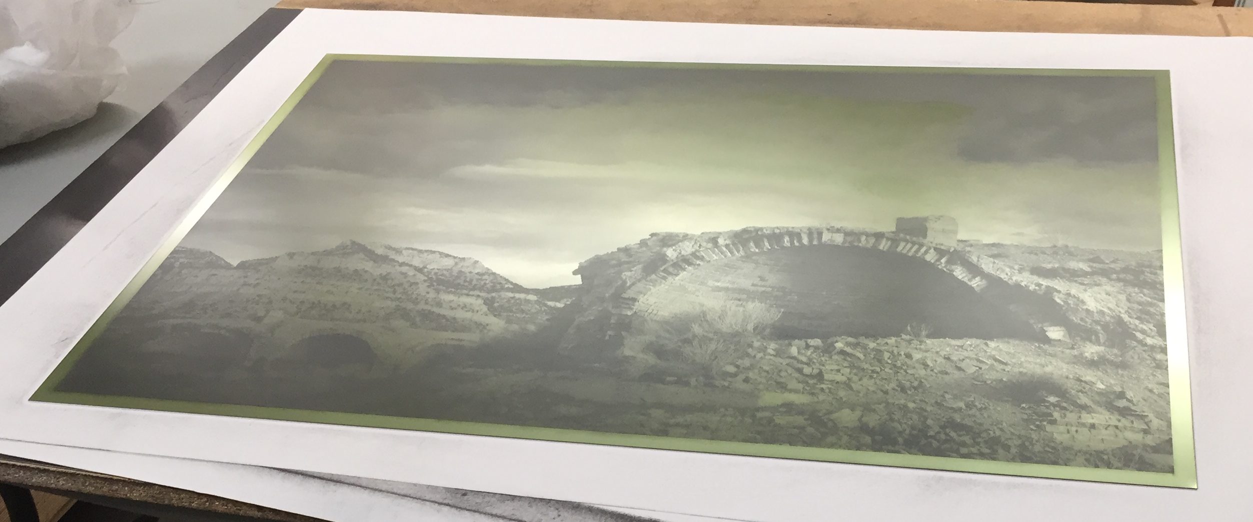
For those of you working with DTP (or direct-to-plate, this info may still be relevant since Newton Rings typically occur between the film positive and the plate. This is because inkjet film is porous, and made to hold moisture (specifically ink). The plate surface also has moisture (as well as a light coating that rinses off in the first few seconds of plate processing). This moisture between the film and the plate is usually the cause of this pesky mottling, sometimes referred to as “measles”. It is characterized by wiggly patterns and collections of dark spots as shown below.
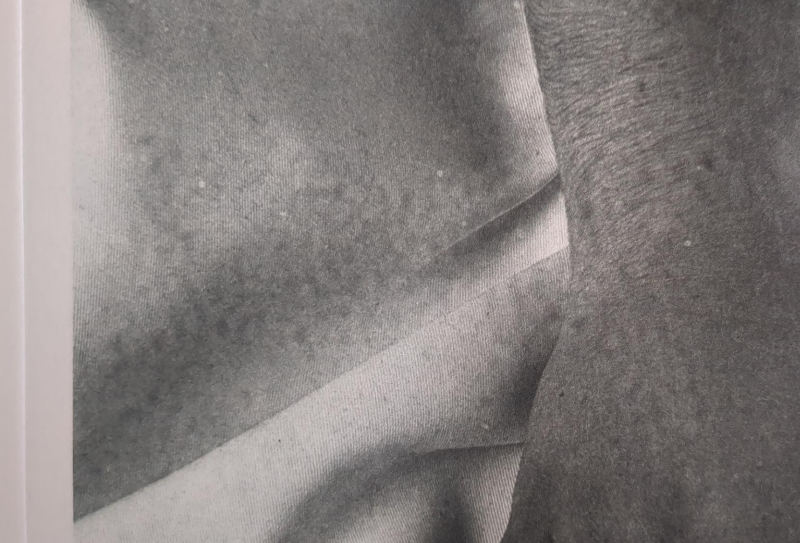
Newton ring mottling example in print
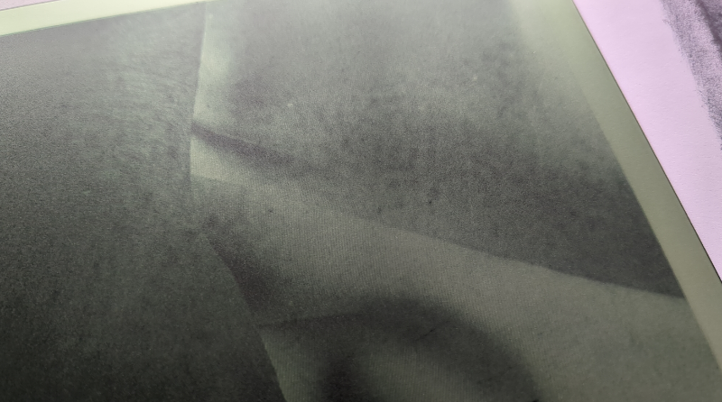
Newton ring mottling example on plate.
In the exposure unit, Newton Rings are clearly visible in the example below as rainbow-iridescent patterns under the glass. These colored patterns block light from getting to the plate, causing unwanted patterns.
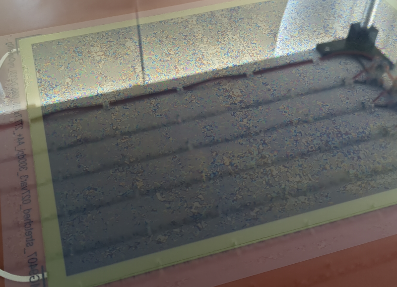
Newton rings forming prior to exposure.
- Dry the film positive in open air for 2-24 hours. then in a heated print drier for 10-12 minutes before exposing. A hair drier will work too.
- Before aligning and exposing film positive, dust plate with baby powder lightly then brush away as much as possible,
- The main way we eliminated Newton Rings at Intaglio Editions was to replace the glass in our frame vacuum with Kreene plastic, as suggested to us by the kind folks at Boxcar Press, in Syracuse, NY. See the link to our full workflow at the bottom of this article.
Another common issue with platemaking is dust specks. These look like a small, pure black, pinprick-sized dot, with a white halo around it. This is caused by dust getting trapped between the plate and aquatint screen. We mitigate it in the shop by having air purifiers running near the exposure unit, and by wiping down the vacuum frame with anti-static cleaner before every plate made.
When troubleshooting, make sure your aquatint screen is clean too, and isn’t showing any of the same patterns, as you’re seeing in the print. I found that storing an aquatint screen on top of some unexposed plates for a period of time caused condensation to form on the screen, which showed up as mottling in subsequent plate exposures. The light residue was easily removed with film cleaner, but I wasn’t expecting that to be an issue, until it was.
Thanks to At Honig for their photo documentation.
View my full, but somewhat outdated, Polymer Photogravure Procedure here.
Working on a project with a budget means minimizing expenses. Save yourself massive headaches, months of testing, and thousands of dollars learning platemaking and order custom plates from Intaglio Editions in Colorado USA at https://shop.intaglioeditions.com