Fifteen Year Challenge for Finer Polymer Photogravure Prints

When I first put my procedure for making and printing polymer photogravure plates online in 2006, it was after a few years of my own frustrations in the process. I posted it in response to a lack of comprehensive information about the subject as it pertained to creating continuous tone images for photography. The traditional printmakers weren’t concerned with it, and the computer nerds (of which I am one) didn’t have any meaningful elbow grease or track record when it came to making traditional intaglio prints.

Jon Lybrook, Master Printmaker, Intaglio Editions
Jon Lybrook, Owner and Master Printmaker, Intaglio Editions

Picking up where others’ work had left off, I created a custom workflow and process compensation curve to accommodate a finer, higher-resolution aquatint screen than anyone else was using at the time. Our screen is 2-3 times as fine as traditional rosin dust used for aquatinting copper photogravure plates. At 1200 dpi, our fine, third-generation, heavy-duty aquatint screens with custom stochastic pattern are a double-edged sword. We don’t sell them to the public because they are less forgiving than coarser screening processes, but yield superior, fine continuous tones for photogravure when handled and used under a controlled environment using the tried-and-true KM73/83 plates by Toyobo, for which our screens and system for making continuous tone plates was designed.

While excellent technical books on polymer platemaking and creating digital negatives for contact printing are now available, there were but a few good ones in 2004. The only one most of us referenced was written by digital negative pioneer and process wizard Dan Burkholder. Today, faster methods to getting inkjet-quality photogravure prints from polymer, such as Direct-to-Plate (as taught by printmaking instructor Don Messic) and reliable, open-source software for calibrating your printer drivers for making custom digital negatives now exist.

While direct-to-plate (DTP) is easier and faster to teach polymer plate making certainly, it does not employ a critical, secondary aquatint layer to create the proper plate texture and variable depths. This is what gives photogravure its unique 3D qualities, otherwise you’re just printing a flat inkjet print that’s been transferred flatly to a plate. This critical aspect of plate depth and ink relief is among the most apparent qualities in traditional photogravure prints – when made on on finer, Asian, gampi papers, in particular. While hard to demonstrate in a digital image, the look of a traditional copper plate photogravure, when executed properly, is unmistakable.

Cross-section of photogravure plate
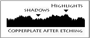
Illustration by Peter Miller

While DYI is all the rage, some artists need an experienced, dedicated technical collaborator who understands their goals. Finding someone who has an intimate knowledge of the photo mechanical process as well as intaglio printing itself, is still the same today as it was 150 years ago. Finding such an experienced artisan is certainly harder than it was way back then.

Intaglio Editions 20 x 30" large plate
Intaglio Editions 20 x 30″ large plate

As far as process and workflow, not much has changed at Intaglio Editions in our 15 years working with artists, clients, and their collaborators. We still create custom plates to meet client specifications including plates crafted for a specific ink color. In proofing the work with the client to refine the nuances and going back to the digital file and reshooting plates as needed, we have been able to provide the optimal prints our clients demand for their fine art projects. What has changed since the early 2000s is our ability to branch out into new territory, following the traditional processes, bringing the use of polymer even closer to the look (and literal feel) of traditional copper photogravure, without the added toxicity and expense.

Isabel Eaton - Polymer Photogravre printed ca. 2009 by Jon Lybrook
Isabel Eaton – Polymer Photogravre printed 2006 by Jon Lybrook

What makes Intaglio Editions Premium Photogravure Plates different is our custom, high-resolution aquatinting process, and our ability to offer extra large pre-made plates up to 23″ × 39″ (among the largest commercially available). While other methods are limited in size and often leave tell-tale “salt-and-pepper” grain in their photogravures, our traditional double-exposure method creates a more authentically etched plate and print, but at a price. It is more time-consuming and requires more steps and attention to detail than other methods.

So why do we do it? This extra work our process requires follows closer to traditional platemaking methods and gives our custom plates the edge, literally. Unlike newer plate processes, the surface of our plates have detail and textures can be felt by the fingertips. This demonstrates how we provide the smoothest continuous tones possible with this process more in keeping with traditional photogravure plates. Our plates and prints have been praised by artists, photographers and printmaking experts worldwide for their fine nuances, smooth tones, and shadow detail.

Intaglio Editions continues to offer the photogravure-quality plates we use in our printmaking to professional artists and printmakers who love making rich, photographic prints, but who may not be interested in becoming expert platemakers as well. This helps our friends and customers get faster results, and helps them achieve that last stride of excellence that so often eludes newer plate makers, or those new to photogravure printmaking.

New and experienced printmakers alike may want to take advantage of our long-standing $99 Trial Plate offer. We’ll create an 8″ × 11″ plate of your custom image using our custom, double-screened, high-rez platemaking method for just $99, to see if our plates don’t provide the smoothest, richest continuous tones you’ve ever seen from this process. Shipping, handling and customs, duties, or other fees will apply. Our Premium Photogravure Plates and other customer services are available at the Intaglio Editions Shop.

Deriving Curve and Exposure Times from Scratch (Part II)

I’ve been talking with copper gravurist Barbara Sanders over Email some more about the challenges with first establishing exposure and washout times when processing a polymer plate.  Also when is the right time to begin tweaking the curve applied to the transparencies.  I’m hoping that documenting her journey helps provide insight to others.

~~^*~^*~^*^~*^~*~^*~^*~^*~^*^~*~^*^~*^~*^*^~*~^*~^*^~*~^~^

Barbara said:

Spent most of the day making test plates and trying to get the work flow correct. Not a bad day and feel I am close to proper exposure times. I am starting to collude that my transparency needs adjustment (the dreaded curves question!).

small-step-wedgeI included the following step wedge with my test image to evaluate where things weren’t getting enough information.

0, 10, and 20% are pure white; there is no difference in black 90, 100; my 70 reads like the 80.

I am thinking if I lose density in the blacks and lower the output of the whites that they might darken (grey). Correct?…Hard to figure which variables to tweak first.

~~^*~^*~^*^~*^~*~^*~^*~^*~^*^~*~^*^~*^~*^*^~*~^*~^*^~*~^~^

Hi Barbara,

Thanks for the info.  You’ve basically got 20 steps which is an ambitious undertaking flying solo, but more information is better than less.  You should be able to get 20 unique tones with this process using Mark Nelson’s screen and the KM73 plates.  The last 10% of perfection is always the hardest won.

My sense is if you’re losing the top 20% of your highlights 10% of the shadows (with 70 and 80 looking the same), you need to pull down your exposure times a little and get paper white at 0% and some tone in the 5% area to start with, before tackling the curve (which is how you can address at least some of the midtone/shadow detail issues later).  Whether you pull back time on the aquatint screen or the film positive, or both is the question.  If you lack enough exposure, the black areas of the plate will go mushy, so that will be your cue if you’ve gone too far and don’t have enough exposure time.  Varying even 5 seconds of washout will also make a difference from my experience, so if you’re getting too mushy, you might back off washout time as it is the third physical variable you want to get a grip on (in addition to your two exposure times) before tweaking curves.  If the plate gets too sticky and sticks to the newsprint when blotting, you may need to increase washout time (or exposures).  How the plate feels is the first step to getting this first part right.

You really want to get as close as you can to even distribution of tones using exposure and washout times before fine tuning with the process compensation curve.  It’s a dance between increasing and decreasing these three times until you’re safe to mess with the curve.  Changing too much at once out of frustration is tempting, but don’t do it.  That way lies madness.  😉

You may also find once you start tweaking the curve, you have to tweak exposure and washout times yet again.  Don’t be discouraged, as this is the way you need to juggle the variables until things start coming together.  It’s time consuming, but the only way I know how to go about it with any accuracy given the multitude of variables.

For my current workflow using my custom screen I use the following exposure times:

Screen Exposure Time:  10.5 units
Image Exposure Time:  14.5 units

I’m giving this as an example: This ratio of screen to image time is not critical as there doesn’t seem to be any rhyme nor reason to it with any printmakers I’ve spoken with to date.  It just depends on your other variables (film density, exposure unit, screen quality).  I’ve seen people have screen and image times equal or vary as much as 100%.

Another tip:  Make sure you always warm up your exposure unit by blasting it for 60 seconds before exposing plates for the day.  It will normalize the exposure to some degree I’ve been told.

Best of luck.  Send me a scan of your printed exposure test if you’re able.

Jon

Deriving Curve and Exposure Times from Scratch

Met with seasoned copper gravure printmaker Barbara Sanders this week and had a lively exchange of information with her and her ceramicist husband Bill regarding the craft and business side of art.  Barbara is migrating from copper to polymer with great success as she works toward “close enough to perfect” to feel good about the process.  This is the quandary with most printmakers as our thirst for perfection is hard to quench.

The main geek topic of our conversation was how to best start to derive a compensation curve and exposure times.  Barbara had taken a sample of my company’s custom aquatint screen back home with her after our meeting and came back with some absolute numbers.  Here is the email exchange and some of my thoughts about starting to derive a curve, screen exposure time and image exposure time:

—–Original Message—–
From: Bill and Barbara Sanders
Sent: Wednesday, January 16, 2013 9:48 AM
To: Jon Lybrook
Subject: thanks

Such a fun afternoon!
Thank you for taking the time to see me and my work. I sure love your prints!
I measured the density of your screen  :  about 53/54 whatever units the densitometer is in
my new screen   : about 168/170
my old screen     : about 80/83
hence the different exposure times aside from our different exposure units wattage. Complicated but still fun!
Off to Mac class!
Many thanks again.
Barb

———————————-

Thanks Barbara,

Thanks for the screen measurement.  Like I said I don’t know a lot about measuring density. I guess because I pretty much worked out my process backwards from the resulting print back to the curve and exposure times.  The absolute density of a screen and film positive meant nothing to me in the beginning since I had no point of reference, unlike photogravurist John Goodman and those who have had a historical knowledge of their materials and the process.  I could only hope my screens were consistent, and so far they have seemed to be.  But I am curious about it and appreciate your encouragement in that direction.  It would help to verify consistency among my limited stock of custom screens.

Since these screens are made up of dots, as black as we can get the imagesetter to produce them, I’m assuming it’s taking an average of the dots-to-clear-film ratio and coming up with a number.  In other words, it’s not measuring a continuous-tone density as traditional film provides, but rather a combination of these factors.

I’m presuming your screens read darker because the dots are bigger, allowing less light to come through.  Not because the dots on your screens are more opaque than mine, though if your exposure time of the screen/image is too high, the density of the dots on the screen would certainly be a factor as well.

To get a good curve and exposure time relationship, I test first by getting the screen to produce the richest black in my exposure and still provide tone up the scale.  This is where

Gradient circle test Grid by Jon Lybrook

Gradient circle test Grid by Intaglio Editions

those gradient circle tests in my procedure occurred – to get a ball-park sense of where I am.  I would then tweak the curve in conjunction with exposure times until I was able to maintain a rich black and get some added continuous tone in the highlights.  Trying to keep the black where it was, I’d tweak the process compensation curve and exposure times as needed to bring out more and more of the greys in both shadows and highlights.  Kind of like chasing your own tail in a way at first, but these factors start to even out if the testing is paced and consistent.

Subtle, but possibly relevant point pertaining to the quality of the outcome and the reason why I went with an extremely fine screen:  Bigger the dots, the more contrast, the more contrast, the less possible grey tones.  I like lots of grey-tone potential because you can always add contrast in the film transparency and make it more graphic if you want to, but you can’t add broad continuous tone until you’ve been able to achieve it already through a balanced combination of the process compensation curve along with proper exposure times of the screen and film positive.

Best of luck with your curve training.  Let me know if  there are any questions I can answer in your journey!

Best regards,

Jon

.