Please provide your email address below to sign up for our Print Collector’s Mailing list and watch this interview with Tony Levin, or click ‘skip’.
Tony Levin King Crimson Photography Interview
Conducted by Anthony Garone of Make Weird Music – September 2021
Interviewer [00:00]: We are here with Tony Levin in his workshop/studio. And Tony is the basis from King Crimson, Peter Gabriel, and about a thousand other bands he’s played with everyone, just everyone. If you have 10 CDs, you have a CD with Tony Levin on it. So, we are here to talk about Tony’s new collection of photographic prints. It’s a King Crimson box set. What is this set of prints?
Tony Levin [00:32]: Well I’ve been playing bass a long, long time, pretty much since the earth cooled. And most of that time I’ve been taking photographs and I wouldn’t call myself a professional photographer, but that’s because I’m busy playing my music, but I got pretty seriously into it as early as the eighties. And I tried to focus on taking pictures of the bands that I was touring with King Crimson, Peter Gabriel, and others, and in this studio also. And sometime in this last couple of years, I put out a few books of those photos, by the way. And sometime in the last few years, I felt the need to take the best, what I felt feel are the best of those and present them to the public in a really high-quality way and get the best prints possible made from them. It’s been an interesting adventure choosing them and then collating them and having Jon Lybrook do the excellent, super-quality print of them.
Interviewer [01:27]: Can you talk a little about your sort of interest in photography? Like, was it a hardware thing first or was it, did you see an artist that inspired you as a photographer that made you want to do it?
Tony Levin [01:40]: Interesting question. Always interested in photography as a lot of people are. And I kind of muddled around with it a lot of different cameras. I was very lucky that I went to Japan at an early age and this would be in the seventies and was able to get a high-quality Nikon back then when it was a very expensive item here in the states at a reasonable price in Japan, it was a very different economics situation in those days. And shooting film for those of us old enough to remember is a very different experience than shooting digitally on the road. And it was pretty problematic and tricky to shoot regular pictures on the road with bands and get them developed and see how they look, and then make the adjustments at other shows in other cities, in other countries. So, I got used to that, and experimented with it and tried different things. And occasionally I got lucky and got the pictures I wanted.
Interviewer [02:40]: Are you a full-frame shooter, you know, medium format? Like, what do you get in that level of Specifics?
Tony Levin [02:46]: I had a Mamiya RB 67 medium format, and I loved that camera. And I even lugged it around to take pictures. And I’m not talking about with the tripod I mean talking about while I’m playing the bass, picking up this big thing, and trying to shoot. Mostly, I did that with Peter Gabriel. I got some very good pictures which are in some of the books, but in the weeding down process for the pictures I’ve used for the collection those pictures didn’t make it for various reasons when you have, tens of thousands of pictures, and you’re going to get the best eight of them a lot has to go by the wayside.
Interviewer [03:23]: Can you talk about perhaps film versus digital, you know, as a photographer, do you feel like you know, some people say, oh, I only record music on tape, you know, and then there’s the pro tools crowd. They’re like, it doesn’t make a difference. Are you in that sort of a camp? Do you prefer one or the other?
Tony Levin [03:41]: I loved film and I love digital now. I made one of the biggest mistakes in my photographic career, the biggest mistake, switching to digital too early. So, there’s about five, six years of stuff that I’ve got, good photos but they’re not usable. They’re just too low quality because I switched to digital when it was very small. Yeah. So, I don’t have a preference, it was a wonderful process. I loved the smell of the darkroom and I loved that process. And even that smell brings me back to those years that I spent a lot of nights in my darkroom in New York City, my studio apartment, it wasn’t completely dark except at night. So, I would regularly nightly, I would spend the night developing pictures, and then sooner or later one would come out not looking right. And I would look out and realize the sun had come up and it was going through the studio apartment and just barely seeping into the kitchen, which I had curtained off with dark curtains. But it wasn’t enough. So, that was a great process, but so is Photoshop. And so is the digital world.
Interviewer [04:54]: And I imagine you’ve digitized your old film prints. But how many of them, like, were you select things, specific shots, or did you get everything digitized?
Tony Levin [05:06]: I did not get everything digitized, I have too many photos and I never cataloged them well, they are in one place actually here in the building we’re in. But for this, I went through a great number of them and I had already separated the ones that are better than others. And I digitized them as high quality as I could and got them ready for the job.
Interviewer [05:30]: What do you look for aesthetically, or perhaps there’s some other way that you look for a shot that you like, and are there photographers that have inspired you and your aesthetic sense?
Tony Levin [05:44]: There are photographers who have inspired me. I’m not going to name them. I’d have to go through my books to see, but I have a lot of books on photography. And I try to, as with any art, as with music you try to up your artistic sensibility by looking at the best stuff. And somehow having it seep into your sense, especially with format with photos. In my case, because most of the pictures I take, almost all of them are on the road with the same band night after night, you’re doing the same show, maybe different songs, but you’re in the same situation, different dressing rooms. Yes. But dressing rooms night after night, month after month, year after year, even the same dressing rooms. Oh, yes. Four different times I’ve taken pictures of that same guy in that same dressing room through the years. So, one looks for different things than the first time. I can’t really put into words, all the things I look for but I think after all these years, it’s safe to say that I have an eye on the light on everybody and what they’re doing and whether they’re laughing or whether they’re very serious. And if I just see a look, that’s right, I want to have my camera nearby so that I can capture it.
Interviewer [06:55]: Does king Crimson photograph the box set, tell us about it. And you know, what is in it?
Tony Levin [07:03]: Well, its eight photos, eight prints, very high quality. I can’t tell you all the details about the technical bit about the printing, but we can find that from John and very high quality, which I insisted for this, it’s really part of the work of a lifetime of photos on the road and tens of thousands of pictures of King Crimson on the road. And these are my favorites and for reasons, and to me, they tell a story and they each represent that I was lucky to be in that place at that time with a vantage point that other people don’t have from one stage or from backstage being in the band.
Interviewer [07:44]: You’ve been playing for 50 years, right?
Tony Levin [07:49]: Yes.
Interviewer [07:49]: And you know, there’s probably not…
Tony Levin [07:52]: And I’ve been playing well for five years.
Interviewer [07:56]: Yeah. There’s probably not another 50 years, you know, left to go. So, are you looking at this as like a way of, you know, producing some legacy type artwork, you know, something to pass on to the fans or, you know, how are you thinking about it?
Tony Levin [08:11]: Interesting question I don’t think like most guys and women, I know that I play with most musicians. I don’t really think about this in relation to the future. So, this is not the summing up of my career to me or however, I haven’t thought about what I’m going to do for the next book either. I just don’t think about that. When I look through the photos, I recently did a photo book of 250 of my pictures of all bands through the years, I was struck that I really have the chance to present to the public, a very high-quality collection of the images that I like the best. And so, I felt as you sometimes do with music, I felt like this needs to be shared. This needs to get out there. And if I don’t do it in, if this was in the lockdown year, I felt if I don’t do it this year, I’ll get busy touring and doing things that I really love to do and take less immersion and it won’t happen. So, I spent that year trying to get all of these boats together.
Interviewer [09:16]: For me when I’m writing music I’ll have a collection of songs that I’ve produced over the years and some stick around more than others. Is that kind of what happened with this collection? Did you have these photos in mind and at some point I’m going to release it or did you make a decision and just start going through the whole catalog and, oh yeah. There’s that one?
Tony Levin [09:36]: The ladder going through the whole catalog. I never was organized enough with my music or my photography to keep a record of, okay, these are the best. These are, these, and these and these I did have, I had them on, I think the negatives organized by tour and by year. So, it wasn’t that huge a job, but no, it involved going through them all and finding which ones resonated with me in that way, some of them, which were very good images to me and meaningful didn’t warrant, being among the prints, just didn’t warrant. Some of them were color and didn’t want to be in black and white. There were a whole lot of parameters and the ones that were there were plenty that was good. I could limit myself to eighty. It could have been 80 and we’d have a stack of photos to talk about. But I limited myself and, I feel good about the ones we chose.
Interviewer [10:29]: Did you go from 20 to 15 to 10, or did you go from 1 to 3 to, you know, 8 you know, when you were selecting these?
Tony Levin [10:37]: I think it was about 12 to 15 and the decisions on what’s practical for a collection, what I want the box set to look like, and this special custom box for the box set and things like that of course, I think many people will want the individual photo that they like the best and that’s fine. And that’s the way it should be. Yeah. So, the weeding down wasn’t that bad after the point where I headed down to 12 or so.
Interviewer [11:04]: Have you ever done an art show or a gallery of your photography?
Tony Levin [11:07]: I’ve had a few exhibitions through the years and I used to keep a box of the two exhibition sets of photos and I lost them. I lost both boxes. I have the feeling I sent them to be an exhibit somewhere and I forgot about it. And I never asked for them back. I think that’s what happened. I had one from the Woodstock festival, the second one, not the original one, just a wonderful set of prints from the audience in the mud and things like that. And that’s gone.
Interviewer [11:42]: Oh man, that’s tough. So, in your exhibitions, obviously, people know you for the bass and the stick, your music work. But how are people responding? Who doesn’t know anything about, you know, what you play?
Tony Levin [12:00]: I don’t know. I have not been to exhibitions of my photos.
Interviewer [12:04]: Okay.
Tony Levin [12:04]: What I hear a lot from is, are bands of the bands and the, of course, I put the photos on my website and on my web diary, right? My road diary and I have for many years. And I hear a lot of feedback that people love the photos, of course. And I’m probably happiest that I can finally offer it to them. Oh, you, maybe you wanted that photo on your wall. It’s nice to finally have that option. But I don’t really have too much experience of people seeing the photos, who don’t know the band or know me and what it is. I do musically.
Interviewer [12:36]: And for me, I don’t know, perhaps you’re like this, you’re an early adopter of technology, you know, you’re using digital cameras. I see you using a 360-degree camera?
Tony Levin [12:46]: Abusing it.
Interviewer [12:47]: Abusing it. And I’m curious, is this kind of like, maybe you get sick of looking at a screen and you just want to see these things on paper?
Tony Levin [13:00]: Oh, yes. I had mentioned before the tactile joy of having something that you can say, this is it, but also my life, my home, and my life are enriched by the very high-quality paintings and photos that I have on the wall. And so I have, I think, like most people, I have a high, I place a high value on the one picture that’s very special to you. And if it has a double meaning, because it, it, it involves a band that you’re a fan of, or a concert that you are at or something like that, then all the better.
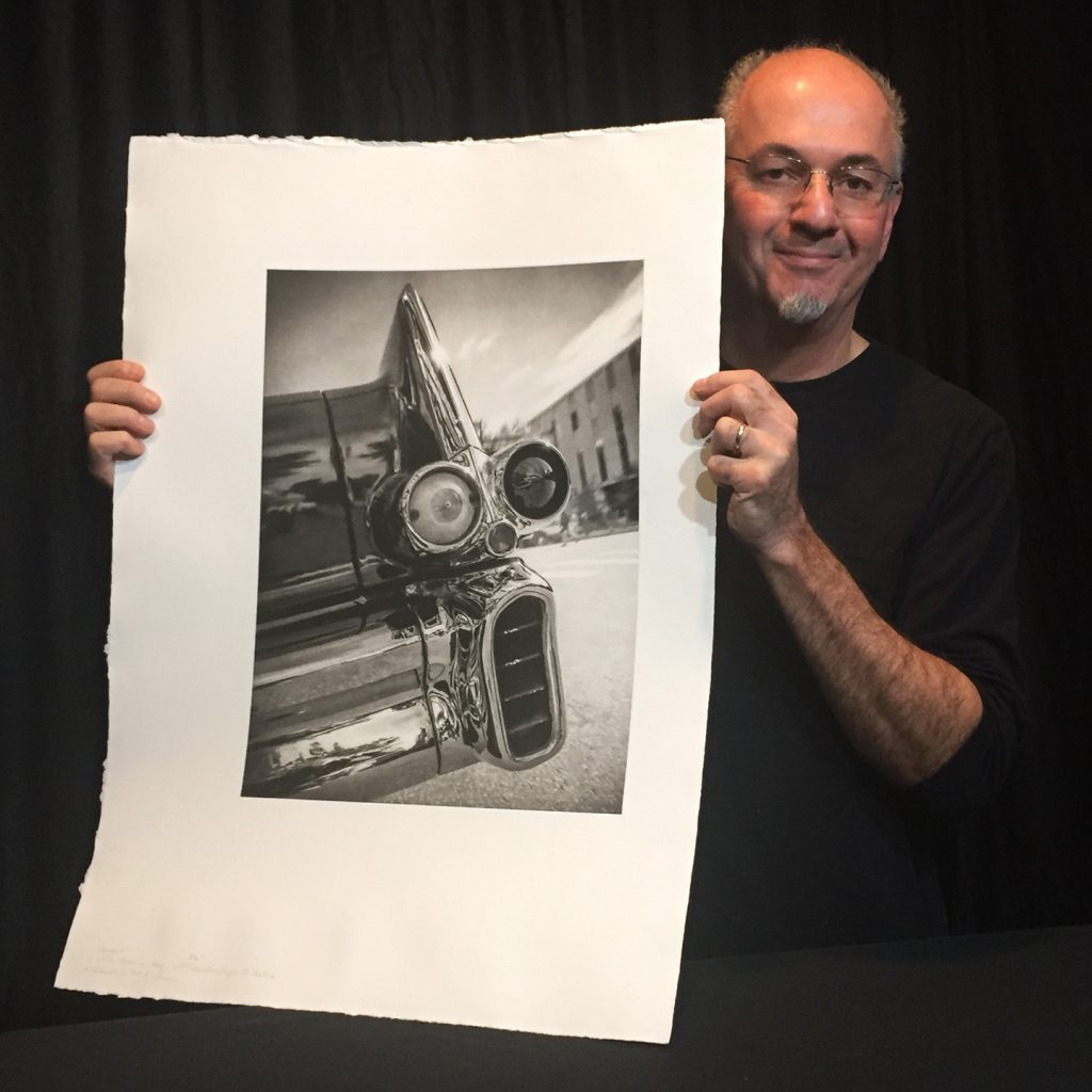
 “Some of the design details from the late 1950s cars were pretty crazy – they where like chrome & plastic sculptures from a bizarro, futuristic world! However, I think the tail lights of the 1957 Cadillac Coupe de Ville were the most amazing, especially for it’s Mohawk topped, humanoid expression of surprise.
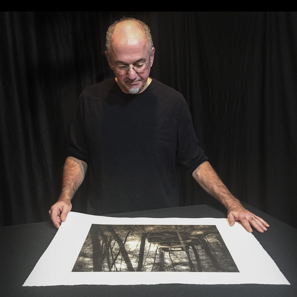 I first encountered this Ford truck on a neighbor’s property in 1997, shortly after we purchased our home just up the road from them. I thought it was pretty cool, but it somehow didn’t even occur to me to photograph it at the time. However, when the rusty bug finally bit me all these years later, I went out on a hot spring day in 2018 to find it still quietly tucked away, though much further out in the woods than I remembered.
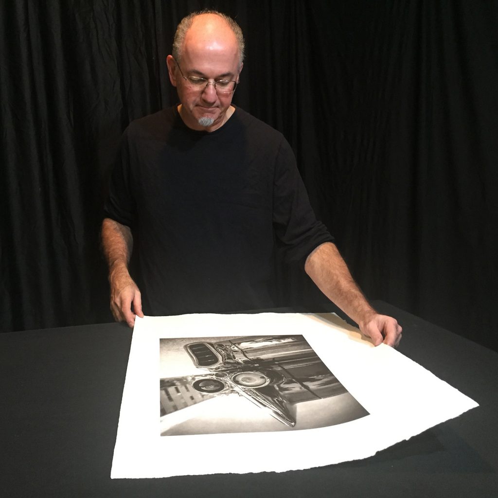
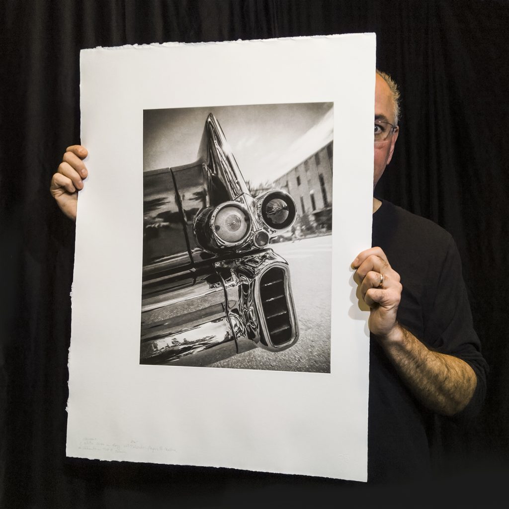 I’ve photographed this beautiful barge of a car abandoned in the woods a few times, but “Panic on Main Street” is the first time I encountered a restored vintage model at a car show. I got to the huge Elm Street Classic Car Cruise in Manchester, NH late that September day, and as it was winding down I saw this car getting ready to drive off from it’s spot. I quickly asked the owner if I could take a few shots before he did, and I went right to the back and laid down on the hot pavement to capture this!